Maximize Reach and Engagement with Responsive Web Design Service

Responsive designs not only meet user expectations but also receive Google’s mobile-friendliness badge, which helps in improving search engine rankings. Our responsive web designs ensure an effortlessly accessible user experience retaining 73.1% of visitors, no matter the device. 

  • Utilizing AI to create adaptive, user-responsive designs.
  • Expertise in CSS Grid and Flexbox for smooth layouts.
  • Leaders in mobile-first designs with optimal speed and usability.
  • Focused on accessible responsive sites for all users.

Expanding Web Horizons

Adapting To The New Digital Web Designs

Is your website failing to perform on smartphones and tablets, leading to frustrated visitors and lost sales? In a world where mobile browsing dominates, a non-responsive site means missing out on a huge audience segment. As of 2023, 79% of people shop on mobile devices. A non-responsive website could cost you over 50% in potential business due to lower mobile traffic ,higher bounce rates and lower conversions.

We ensure your site looks great and functions perfectly on every device, focusing on accessibility, ease of navigation, and speed, aiming to boost your presence and sales. Don’t let your Customers go without making a purchase,  Let’s make your website accessible to everyone, everywhere.

0 +

Project Continue

0 +

Project Completed

Our Sub Services In Responsive Web Design

Fluid Grid System Implementation

CSS3 Media Queries Application

Interactive Elements

Optimized Image Scaling and Compression

Responsive Typography Adjustment

Cross-Device Compatibility and Testing

Performance Optimization for Mobile Devices

Accessibility Compliance for Responsive Design

Responsive Design Upgrades and Renovating

Fluid Grid System Implementation

We use a fluid grid system to create flexible layouts that adapt seamlessly to different screen sizes. This technique is central to our responsive web design, ensuring content completeness and usability across various devices. Additionally, it helps in maintaining a consistent look and feel of the website regardless of the viewing environment.

CSS3 Media Queries Application

We apply CSS3 media queries to customize the appearance and functionality of your website to different devices. This method allows us to provide an optimal viewing experience by applying specific styles based on device characteristics such as width and orientation. It also enables us to fine-tune responsive behaviors for landscape or portrait modes.

Interactive Elements

We incorporate interactive elements to enhance user engagement and usability. By designing dynamic features that respond to user interactions, we elevate the overall user experience on any device. This also includes the integration of touch-friendly interfaces suitable for mobile and tablet users.

Optimized Image Scaling and Compression

We optimize images through scaling and compression to accelerate loading times without compromising image quality. This practice is crucial for improving the performance and speed of your website on mobile and desktop devices. Our techniques also help reduce bandwidth usage, which is beneficial for users on limited data plans.

Responsive Typography Adjustment

We adjust typography responsively to ensure that text is readable and aesthetically pleasing on all devices. This approach involves scaling font sizes, line heights, and spacing based on the device’s display properties. We also prioritize readability and accessibility in typography choices to enhance user experience.

Cross-Device Compatibility and Testing

We ensure cross-device compatibility by extensively testing your website on various devices and operating systems. This process helps us identify and resolve Differences to guarantee a consistent user experience everywhere. Our rigorous testing covers a range of devices from smartphones to large desktop monitors.

Performance Optimization for Mobile Devices

We specifically optimize performance for mobile devices to ensure fast loading times and smooth interactions, addressing the unique challenges of mobile connectivity and processing power. Optimization tactics include minimizing code, leveraging browser caching, and asynchronous loading of resources.

Accessibility Compliance for Responsive Design

We adhere to accessibility standards in our responsive designs to ensure that your website is usable by people with disabilities. This includes implementing features that support screen readers, keyboard navigation, and sufficient color contrast. We also focus on ensuring that all interactive elements are accessible via assistive technologies.

Responsive Design Upgrades and Renovating

We can update your existing website with the latest responsive design techniques, making it more modern and efficient. This service revitalizes your site, ensuring it functions beautifully on current devices, enhancing both its appearance and performance.

Tell us Your Problem

Please Complete the form, and we will ensure to contact you within 24 hours.

Please enable JavaScript in your browser to complete this form.

Our Step-by-Step Innovation Process

Consultation and Documentation

We start by consulting with you to understand your project's goals and specific needs. During this phase, we also gather and document requirements, including a comprehensive device inventory to ensure compatibility across all targeted platforms.

Figma Design

Using Figma, we design responsive layouts that visually represent how your website will adapt to different devices. This step includes creating wireframes, prototypes, and high-fidelity designs that ensure usability and aesthetic appeal across all screen sizes.

Development

With designs approved, we move into the development phase. Our developers use the latest web technologies to translate Figma designs into functional, responsive web pages. This stage focuses on implementing a fluid grid system, CSS3 media queries, and interactive elements.

Cross-Platform Implementation

We then apply cross-platform coding standards to ensure that the website functions seamlessly on various devices and operating systems. This includes adjustments and optimizations for different browsers, ensuring consistency and performance across the board.

Optimization and Performance Tuning

After initial development, we focus on performance tuning and optimization, particularly for mobile devices. This involves refining code, compressing images, and testing responsive typography to enhance loading times and overall user experience.

Q/A and Launch

Finally, we conduct thorough quality assurance testing, covering functionality, responsiveness, and user interface on multiple devices. Once testing confirms that all elements perform correctly, we proceed with the website launch, ensuring your site is ready to impress and engage users from day one.

Explore our clients testimonials 

Here from Our Satisfied Clients

Why choose cortech 

Responsive Web Design Services

Mastery in Fluid Grid and Flexible Layouts

At Cortech, we're experts at using fluid grid layouts and flexible content to make sure your website looks great and works well on any screen size. We make sure your site adjusts smoothly for the best user experience, no matter the device.

Advanced CSS3 and HTML5 Use

Our team uses the latest CSS3 and HTML5 technologies to create responsive websites that aren't just beautiful but also work perfectly. This approach keeps your site up-to-date with new web standards and ready for future devices.

Expertise in Progressive Web Apps (PWAs)

We specialize in turning regular websites into Progressive Web Apps. This gives your site app-like features, such as working offline, sending push notifications, and fast loading, which are especially beneficial on mobile devices.

Responsive Design Retrofitting for Legacy Sites

For older websites, we offer services to update them with responsive design features. This includes a thorough technical update to make sure they perform well and look good on all modern devices.

Start Your Innovation Journey with Cortech

Get to Know Cortech

Frequently Asked Questions

In our responsive web designs, we primarily utilize HTML5 for structuring content, CSS3 for responsive layouts, and JavaScript for enhancing interactivity and device-specific functionality. CSS3 media queries are crucial in our approach to ensure the website adapts smoothly across different devices.

We use CSS media queries to apply different CSS styles based on conditions like screen width, height, orientation, or resolution. This approach is essential for tailoring the presentation of content to fit various devices, ensuring a consistent user experience.

Our responsive images are designed to adjust in size based on the screen using CSS techniques such as setting max-width to 100% and height to auto. We also use the HTML5 to serve different image files depending on the screen resolution and size, optimizing the viewing experience.

Yes, if not properly implemented, responsive web design can impact performance. We address this by employing conditional loading, optimizing images, and minifying CSS/JS files to ensure our websites load efficiently on all devices.

We ensure that our responsive designs are accessible by making content navigable and readable on all devices. This includes implementing appropriate font sizes, ensuring adequate contrast ratios, and designing interactive elements that are easy to use on touch screens.

Breakpoints are specific points where the website's content and layout change to offer the best user experience. At Cortech, these are determined based on common device screen sizes, and we utilize CSS media queries to implement these adjustments dynamically.

We integrate server-side components to deliver optimized assets and tailor content according to the user’s device. This method, known as RESS (Responsive Web Design with Server-Side Components), combines client-side responsiveness with server-side efficiency for optimal performance.

Read Our

Latest Articles

AI in Transforming Customer Interactions

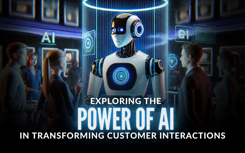
Exploring the Power of AI in Transforming Customer Interactions

AI handling your customers! Do you still think it’s not possible? Welcome to a world where your next customer service interaction could be faster, smarter, and more customized to you than ever before! Imagine getting support from a chatbot that responds so quickly, it feels like it reads your mind.

Read More »
Staff Augmentation Case Study

Staff Augmentation Case Study

In a world where change is the only constant, staying adaptable is key to success. At CorTech, we know that the right talent can make or break a project. That’s why we specialize in staff augmentation—a strategic outsourcing model that not only fills gaps in your team temporarily but seamlessly

Read More »